Line chart is common used in data analysis field, it is easy to implement in python. In this tutorial, we will introduce python beginners to understand how to draw a line chart.
Preliminary
You should install python matplotlib package first.
- pip install matplotlib
If the speed of your pip mirror is slow, you can change it to install matplotlib. Here is a tutorial:
A Simple Guide to Change Python Pip Mirror URL – Python Tutorial
We will draw a sin(x) function to illustrate how to implement a line chart in matplotlib.
Prepare data
We will create some points by sin(x) function, here is an example code.
- import numpy as np
- import matplotlib.pyplot as plt
- x = np.linspace(0, 2 * np.pi, 20)
- y = np.sin(x)
Show sin(x) line chart
Code below will show sin(x) line chart.
- plt.plot(x, y)
- plt.title('sin(x) function example')
- plt.xlabel('x')
- plt.ylabel('y')
- plt.show()
Run this code, you will see:

Change the line width of line chart
You also can change the line width of line chart with parameter lw. Here is an example:
- plt.plot(x, y, lw=4.0)
The effect is:

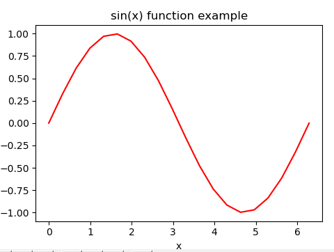
Change the line color of line chart
We also can change the line color by parameter c. The value of parameter c can be:
| character | color |
|---|---|
| ‘b’ | blue |
| ‘g’ | green |
| ‘r’ | red |
| ‘c’ | cyan |
| ‘m’ | magenta |
| ‘y’ | yellow |
| ‘k’ | black |
| ‘w’ | white |
or the hex value, such as c = #ff6600.
Here is an example:
- plt.plot(x, y, c='r')
or
- plt.plot(x, y, c='#ff0000')
The line chart will be:
Change the line style of line chart
We can use parameter ls to change the line style, the value of ls can be:
| Style | Name |
| – | solid |
| — | dashed |
| – | dashdot |
| . | dotted |
| ” | None |
Here is an example:
- plt.plot(x, y, ls = 'dotted')
The effect of line chart is:

Change the marker of line chart
We can use the marker parameter to change the style of the marker in the line chart, the value of marker can be:
| character | description |
|---|---|
| ‘.’ | point marker |
| ‘,’ | pixel marker |
| ‘o’ | circle marker |
| ‘v’ | triangle_down marker |
| ‘^’ | triangle_up marker |
| ‘<‘ | triangle_left marker |
| ‘>’ | triangle_right marker |
| ‘1’ | tri_down marker |
| ‘2’ | tri_up marker |
| ‘3’ | tri_left marker |
| ‘4’ | tri_right marker |
| ‘s’ | square marker |
| ‘p’ | pentagon marker |
| ‘*’ | star marker |
| ‘h’ | hexagon1 marker |
| ‘H’ | hexagon2 marker |
| ‘+’ | plus marker |
| ‘x’ | x marker |
| ‘D’ | diamond marker |
| ‘d’ | thin_diamond marker |
| ‘|’ | vline marker |
| ‘_’ | hline marker |
Here is an example:
- plt.plot(x, y, marker='v')
The marker of this line chart will be:

We should notice: if you have set the line color of line chart, the color of marker is also be changed. Here is an example:
- plt.plot(x, y, c='#ff0000', marker='v')
The line chart is:
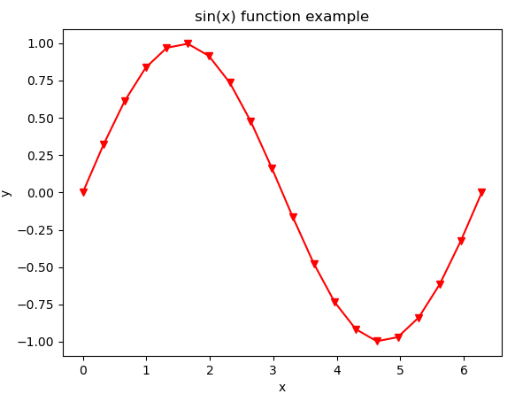
From the picture above we can see: we have set the line color to be red, the color of marker is also set to be red.
