In python, we often save some data with a dictionary, which is very good to save data what contains label:number. In this tutorial, we will introduce you how to plot a bar chart with this dictionary using python matplotlib.
Step 1: import libraries
import matplotlib.pyplot as plt
Step 2: create a python dictionary with label:number
For example:
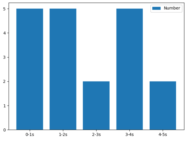
data = {"0-1s":5, "1-2s":5, "2-3s":2, "3-4s":5, "4-5s":2}Here the keys of data are label and the values are number.
Step 3: plot a bar char
names = list(data.keys())
values = list(data.values())

plt.bar(range(len(data)), values, tick_label=names, label = "Number")
plt.legend()
plt.show()
Run this code,we will see:

Step 4: if you want to order dictionary with number, then plot a bar char, you can read:
Sort Python Dictionary by Key or Value for Beginners – Python Tips
Step 4: if you want to change the color of bar, you do as follows:
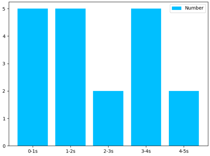
plt.bar(range(len(data)), values, tick_label=names, label = "Number", color='deepskyblue')
plt.legend()
plt.show()
Then we will see:

If you want to know what colors you can select, you can read:
List of Matplotlib Common Used Colors – Matplotlib Tutorial