Line chart is common used in data analysis field, it is easy to implement in python. In this tutorial, we will introduce python beginners to understand how to draw a line chart.
Preliminary
You should install python matplotlib package first.
pip install matplotlib
If the speed of your pip mirror is slow, you can change it to install matplotlib. Here is a tutorial:
A Simple Guide to Change Python Pip Mirror URL – Python Tutorial
We will draw a sin(x) function to illustrate how to implement a line chart in matplotlib.
Prepare data
We will create some points by sin(x) function, here is an example code.
import numpy as np
import matplotlib.pyplot as plt

x = np.linspace(0, 2 * np.pi, 20)
y = np.sin(x)
Show sin(x) line chart
Code below will show sin(x) line chart.
plt.plot(x, y)

plt.title('sin(x) function example')
plt.xlabel('x')
plt.ylabel('y')

plt.show()
Run this code, you will see:

Change the line width of line chart
You also can change the line width of line chart with parameter lw. Here is an example:
plt.plot(x, y, lw=4.0)
The effect is:

Change the line color of line chart
We also can change the line color by parameter c. The value of parameter c can be:
| character | color |
|---|---|
| ‘b’ | blue |
| ‘g’ | green |
| ‘r’ | red |
| ‘c’ | cyan |
| ‘m’ | magenta |
| ‘y’ | yellow |
| ‘k’ | black |
| ‘w’ | white |
or the hex value, such as c = #ff6600.
Here is an example:
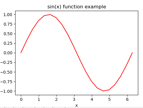
plt.plot(x, y, c='r')
or
plt.plot(x, y, c='#ff0000')
The line chart will be:

Change the line style of line chart
We can use parameter ls to change the line style, the value of ls can be:
| Style | Name |
| – | solid |
| — | dashed |
| – | dashdot |
| . | dotted |
| ” | None |
Here is an example:
plt.plot(x, y, ls = 'dotted')
The effect of line chart is:

Change the marker of line chart
We can use the marker parameter to change the style of the marker in the line chart, the value of marker can be:
| character | description |
|---|---|
| ‘.’ | point marker |
| ‘,’ | pixel marker |
| ‘o’ | circle marker |
| ‘v’ | triangle_down marker |
| ‘^’ | triangle_up marker |
| ‘<‘ | triangle_left marker |
| ‘>’ | triangle_right marker |
| ‘1’ | tri_down marker |
| ‘2’ | tri_up marker |
| ‘3’ | tri_left marker |
| ‘4’ | tri_right marker |
| ‘s’ | square marker |
| ‘p’ | pentagon marker |
| ‘*’ | star marker |
| ‘h’ | hexagon1 marker |
| ‘H’ | hexagon2 marker |
| ‘+’ | plus marker |
| ‘x’ | x marker |
| ‘D’ | diamond marker |
| ‘d’ | thin_diamond marker |
| ‘|’ | vline marker |
| ‘_’ | hline marker |
Here is an example:
plt.plot(x, y, marker='v')
The marker of this line chart will be:

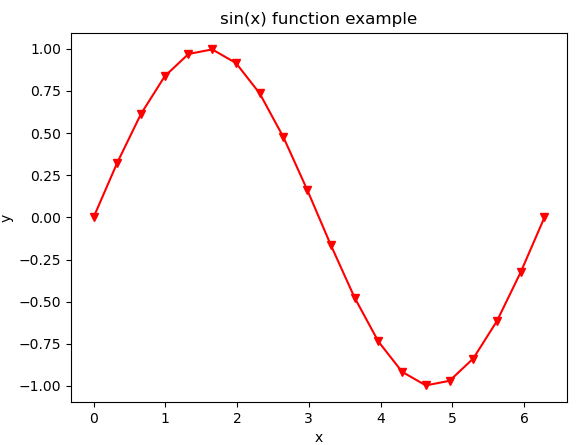
We should notice: if you have set the line color of line chart, the color of marker is also be changed. Here is an example:
plt.plot(x, y, c='#ff0000', marker='v')
The line chart is:

From the picture above we can see: we have set the line color to be red, the color of marker is also set to be red.